Drug ads format: Creating clickable banner ads to increase sales
In today's world of drug ads formats, a well-made banner can effectively communicate your brand's message, attract viewers and ultimately increase sales. In this blog post, we will explore the key elements of creating a successful banner and explain the basics of banner advertising.
What is banner advertising
Banner advertising involves placing graphical ads on websites, apps or social media platforms. Its purpose is to catch people's attention and motivate them to take action, such as visiting a website or making a purchase. By strategically placing banners in busy online areas, businesses can reach their target audience and raise awareness about their brand.
Banner ads serve the purpose of promoting new products or services and increasing brand awareness through visual means. Well-designed banners have the potential to immediately grab people's attention. Even if the target audience doesn’t make a purchase, the visuals and message of this drug ads format can leave a lasting impression.

When compared to TV ads, press releases and newspaper ads, digital banner advertising is more cost-effective and straightforward. With banners you can reach a very specific audience and accurately measure the effects it has on it. It is also generally more budget-friendly compared to other forms of paid advertising used in the pharmaceutical industry. Hence, banner graphics are becoming increasingly popular in the fields of animation and design as well, because of the low cost.
A typical banner ad is rectangular in shape, oriented either vertically or horizontally. Drug ad formats are commonly positioned at the top or bottom of a web page horizontally, or on the sides of the page vertically.
Despite the fact that banner ads remain one of the most effective ways of promoting drugs, products and services, it sometimes happens that a user will go through a form of selective attention when reading, preventing them from seeing the ad. This can happen for different reasons, but most likely because the ads did not address the appropriate audience, which means they then consciously or unconsciously chose to avoid interacting with it.
You can avoid so-called banner blindness by following these guidelines:
1. Try to blend in with the look of the website
Try to include a similar design and copy. This way it will look like it's part of the content that the website visitors already trust.
2. Run an A/B test
Test two different creatives or two different copies to see which gets a better response.
3. Choose channels that promote fewer ads
If visitors see that a website is cluttered with ads they back away from it. On the other hand, if an ad is only one of a couple ads on a webpage, the ad will be seen by almost all visitors.

The difference between a web banner and app banner
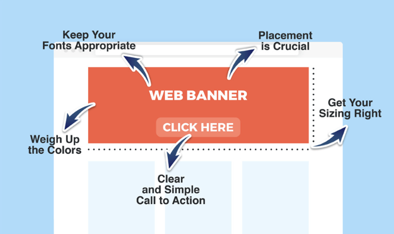
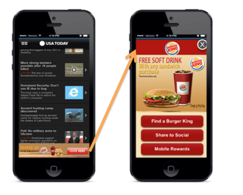
The main difference between an app banner and a web banner is where they are shown. An app banner is displayed within a mobile app, while a web banner appears on a website. App banners are made for smaller screens and are part of the app's layout. They can be small ads or take up the whole screen.
On the other hand, web banners are designed for bigger screens and are placed on websites. They can be at the top, bottom or sides of the page.
Example 1: Web banner

Example 2: Mobile app banner

What makes a drug banner ad clickable
Even if you are not going for clicks, you can go for meaningful and lasting impressions. The term impressions is used to describe the number of times a banner ad is viewed. In contrast, clicks (also known as click-throughs) represent the number of people who clicked on the drug ad format and were directed to the website or landing page.
Aside from these metrics, there can be various other objectives for creating a banner ad, including capturing email sign-ups, boosting sales, generating leads or achieving specific brand-related goals.2
With the increased exposure to various online drug ad formats, users have developed a tendency to tune out these visually prominent elements. However, by implementing certain strategies, such as the four elements explained below, it is still possible to capture the attention of users and entice them to click.
Visual Elements
Placing importance on the colour scheme of a banner ad is crucial. It should align with the overall mood and style of the corporate design of the company. Otherwise, it may seem boring in the midst of a visually attractive page design. Similarly, the other visual elements incorporated into any drug ad format should complement the brand's aesthetics and the website itself. While eye-catching elements are desirable, they should be visually appealing rather than overwhelming.
This includes considering the use of animated elements such as GIFs, which can add a dynamic and engaging touch to the banner.
Animated banners have the potential to capture attention and create a memorable visual experience for viewers. By thoughtfully incorporating animated elements into the banner design, you can create a visually captivating and impactful advertisements that stand out and leave a lasting impression.

Bold Text
Using bold text is a common practice in banner ad designs. However, if everything in the advertisement is bold, it diminishes the overall message's attractiveness. When reading a text-based advertisement, the human eye prefers different stylish fonts and a consistent look. Therefore, it’s important to be creative and bold while still maintaining a harmony with the website's design, as well as the brand's established colour palette and font style.
For example, Mediately created a banner with only two words in bold in a simple text to give enough focus on the message it wanted to communicate.

Images
Images play a central role in designing a banner ad and are vital for display advertising. The images should captivate visitors while directing their attention to the ad's message. If the ad is promoting a product, it's advisable to feature a clear and high-quality image of the product. For example, we placed portrait photos of our co-founders on a square L-sized banner in our app.
When selecting images for a drug banner ad, clarity and simplicity are key, regardless of the desired innovation and ambition. Overly complex images can hinder the effectiveness of the digital advertisement.

A Clear Call to Action
A concise and straightforward call to action (CTA) lies at the heart of any good drug banner ad. The CTA informs viewers about the action they should take upon seeing the ad. Common words used as CTAs in digital banner ads include "Buy," "Get it now," and " Find out more."
In our case we used "Search" and "Edit" to keep the message clean. This helps our users understand where they will be directed if they click on a specific banner ad.

How to make a banner (in 10 easy steps)
Follow this step-by-step guide for starting a great banner ad design:
1. Define your goals: Decide whether you want to increase brand awareness, drive website traffic, generate leads, promote a specific product or achieve another specific goal? Begin by clearly outlining the objectives you want to achieve with the drug ad format.
2. Identify your target audience: Understand your target audience's demographics, interests and preferences. This knowledge will guide your design choices and help you create a banner that resonates with your intended viewers.
3. Choose the right platform or design software to create your drug banner ad: Options like Canva, Adobe Illustrator and Adobe Photoshop offer user-friendly interfaces and a range of customisable templates and design tools. Check out some other powerful tools below.
4. Determine the banner size and format: Research the recommended sizes and formats for drug ad formats on the app or website where you plan to display your ad. Ensure your banner meets the required specifications for optimal visibility and performance.
5. Craft a compelling message: Develop a concise and impactful message that aligns with your goals and speaks to your target audience. Focus on the key benefits or unique selling points of your product or service. Keep the text simple and easy to read.
6. Select relevant visuals: Choose visually appealing graphics, images or animations that complement your message and capture visitors' attention. Ensure that the visuals align with your brand's aesthetics and the overall tone of your banner.
7. Design with a clear hierarchy in mind: Create a clear visual hierarchy by prioritising key elements such as the headline, visuals and call-to-action (CTA). Use fonts, sizes and colours strategically to guide viewers' attention and ensure they understand the main message at a glance.
8. Incorporate a strong call-to-action (CTA): Include a compelling CTA that clearly prompts viewers to take the desired action. Make the CTA visually distinct and position it prominently within the banner.
9. Test and optimise: Before finalising your banner, test it across various devices and platforms to ensure it displays correctly and looks appealing. Make any necessary adjustments based on feedback and performance metrics, such as click-through rates.
10. Monitor and analyse results: Once your banner is live, track its performance using analytics tools. Monitor metrics such as impressions, clicks and conversions to evaluate its effectiveness. Use this data to optimise future drug banner ads and improve your overall advertising strategy.
Tools that can help you create the best banner designs
You don't need to be a professional to make great banner ad designs. We've put together a list of some of the tools that can help you create a great pharma banner.
1. Canva
Canva is a versatile online design platform that offers a wide range of templates and tools to create visually appealing drug ad formats. It provides an intuitive drag-and-drop interface, extensive design elements, and customizable features, making it suitable for both beginners and professionals.
2. DocHipo
DocHipo is a user-friendly online tool specifically designed for creating professional-looking banners and documents. It offers a variety of templates, fonts, colours and graphics to customise your banner. With its simple interface and pre-designed elements, DocHipo can be a great design tool for non-designers.
3. Adobe Illustrator
If you have professional designers in your team, they probably know that Adobe Illustrator is a powerful vector-based design software widely used worldwide. It offers advanced features and extensive customisation options for creating intricate and best banner designs. With its robust toolset, precise control over shapes and lines, and the ability to create scalable graphics, Adobe Illustrator is favoured by experienced designers.
3. Adobe Photoshop
Adobe Photoshop is a versatile image editing and graphic design software. While primarily known for its photo editing capabilities, it is also widely used for creating banners. Photoshop provides a wide range of tools, filters and effects to manipulate images and design visually captivating drug ad formats with rich graphics and textures.
4. Abbysale
Abbysale is an online banner design tool that focuses on helping businesses create eye-catching banners quickly and easily. It offers a library of professionally designed templates, customisable elements and the ability to add animations to make your banners more engaging. Abbysale simplifies the design process and provides a time-saving solution for creating effective banners.
5. Placeit
Placeit is a web-based design tool that offers a vast collection of mockup templates, including banner templates. It allows you to easily insert your own designs into the templates, providing a realistic preview of how your banner will look in various settings. With its user-friendly interface and extensive library of templates, Placeit is ideal for showcasing your banner designs in a professional and visually appealing manner.
Conclusion
Banner advertising can be a powerful tool for businesses to reach and engage their target audience. By understanding the basics of banner advertising and following the key elements outlined in this blog post, you can create banners that effectively communicate your brand's message, capture your audience's attention and drive desired actions. Remember to define your goals, know your audience, keep it simple and clear, design for visual impact and include a strong call to action. With these strategies in place, you'll be well on your way to creating successful banner advertisements.
Sources:
- Neil Patel. 15 Examples of Successful Banner Advertising.
- Venngage. 25+ Eye-Catching Blog Banner Templates to Attract Readers.
- Blogging Guide. What is a Blog Banner?
- Creatopy. How to Make a Banner? The Ultimate Guide for 2023.
- Mediately’s archive (2023)
- PepperContent. 20 Fantastic Banner Design Tools to Use in 2022.

